Visualization
Visualizing Markov Chain data is a quick way to see if anything interesting is happening or if anything is obviously wrong. There are a few kinds of common visualization strategies.
The first is to show the value of observables as a function of time. This can help us see if anything suspicious has happened; if proposals have been repeatedly rejected, or observables don’t fluctuate, there may be very long autocorrelations we need to ameliorate in our analysis.
- class tdg.plot.History(rows=1, histogram=5, row_height=3, width=12, **kwargs)[source]
Bases:
objectMarkov Chains provide a natural time along which measurements vary. Both the history and the total histogram are informative.
- Parameters
rows (int) – Number of rows; they share a common time coordinate.
histogram (int) – The width of the histogram is one part in
histogramof the full width.row_height (float [inches]) – The height of each row.
width (float [inches]) – The width of the figure.
kwargs – Forwarded to
matplotlib.pyplot.subplots
- plot(data, row=0, x=None, frequency=1, color=None, **kwargs)[source]
- Parameters
data – A one-dimensional set of data to visualize.
row – Which row to plot in.
x – If not
None, used as the time parameter.frequency (int) – Plotting every sample can prove visually overwhelming. To reduce the number of points in the temporal history, only plot once per frequency.
color – Forwarded matplotlib color.
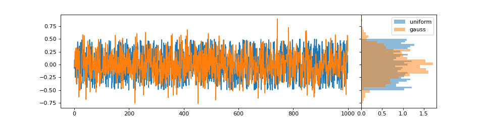
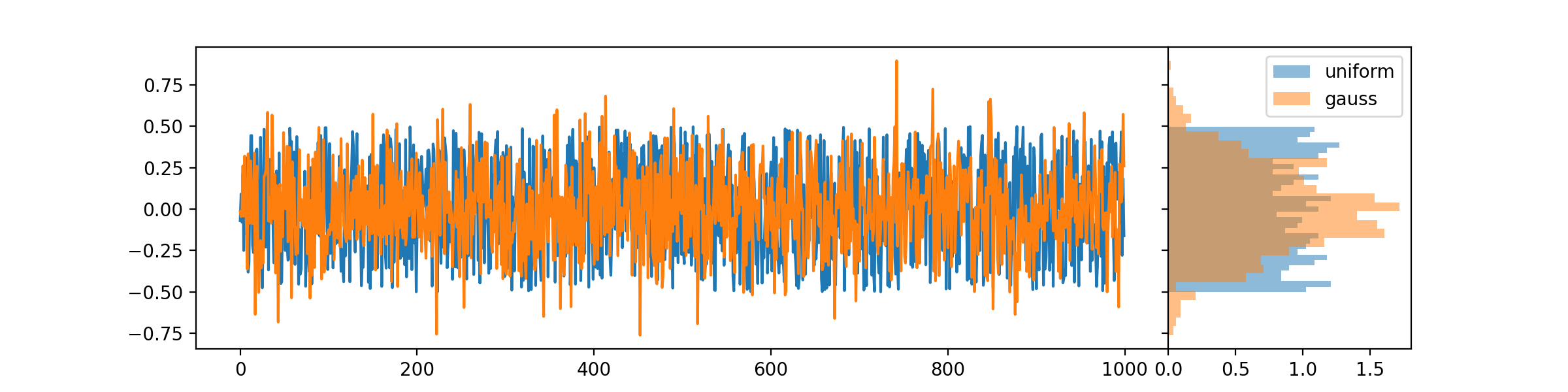
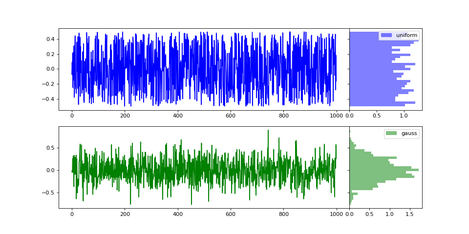
For example, if we have uniformly- and normally-distributed observables, we can visualize them on the same trace, or separately.
#!/usr/bin/env python

import numpy as np
import matplotlib.pyplot as plt
import tdg.plot as visualize

uniform = np.random.rand(1000)-0.5
gauss   = np.random.normal(0, 0.25, 1000)

h1 = visualize.History(1)
h1.plot(uniform, label='uniform')
h1.plot(gauss,   label='gauss')
h1.histogram[0].legend()

h2 = visualize.History(2)
h2.plot(uniform, row=0, label='uniform', color='blue')
h2.plot(gauss,   row=1, label='gauss', color='green')
h2.histogram[0].legend()
h2.histogram[1].legend()

plt.show()
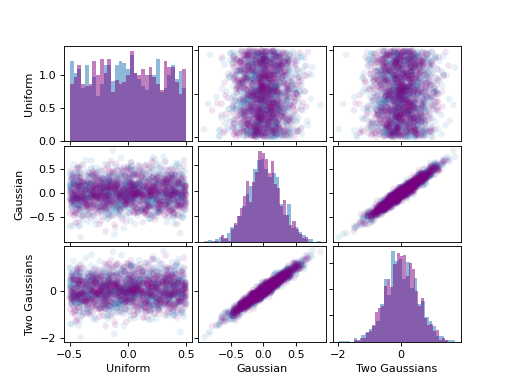
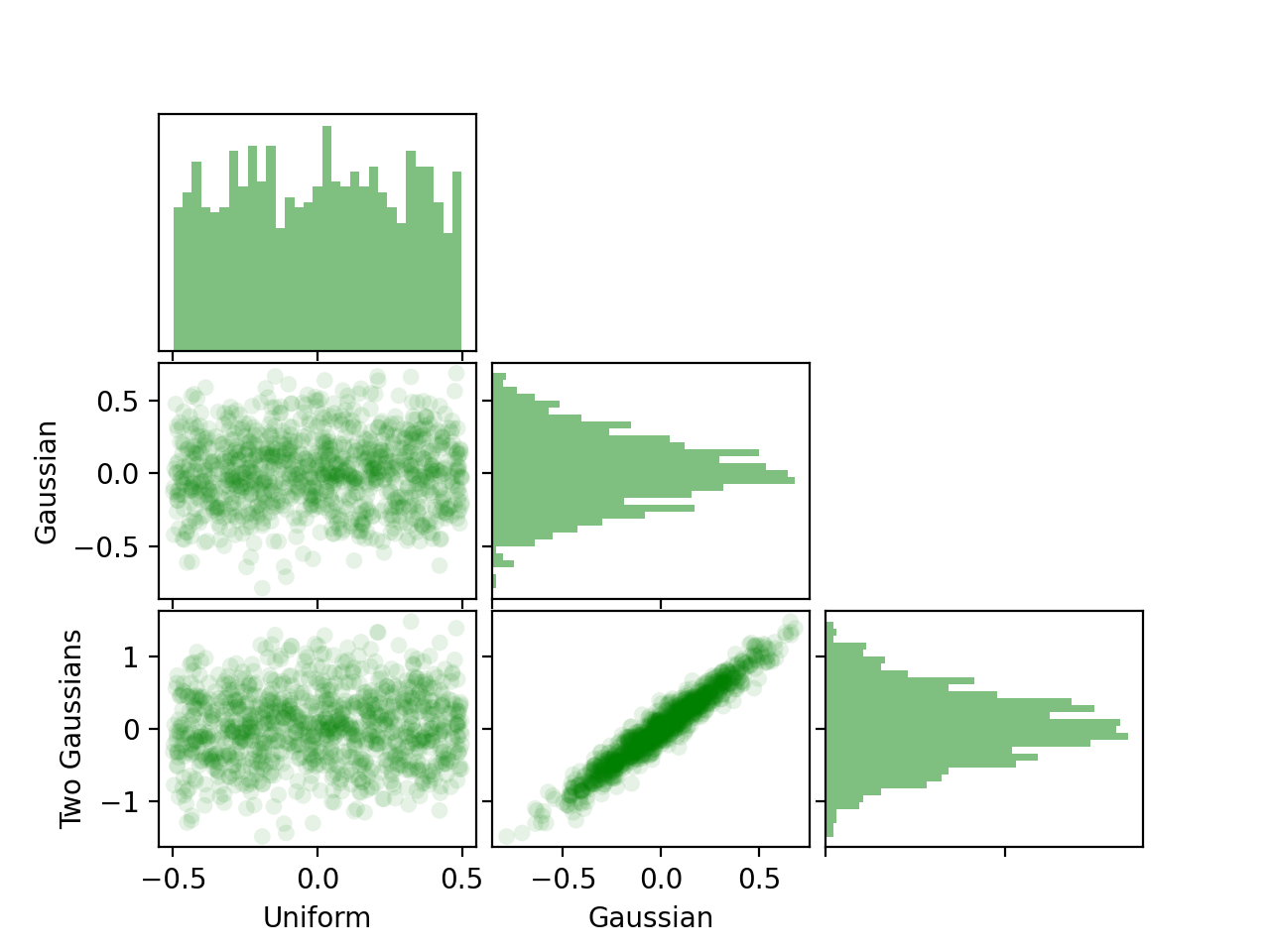
Markov Chain data must often be further analyzed, and correlations in the data can affect uncertainty estimates for post-processed observables. One way to visualize the correlation between different observables is to show scatter plots of different observables.
- class tdg.plot.ScatterMatrix(fields=2, labels=None, wspace=0.05, hspace=0.05, **kwargs)[source]
Bases:
objectDifferent observables are correlated as a function of Markov Chain time, because they are measured on the same state. We can visualize the correlations between many different observables in a grid, each panel a two-dimensional projection of the many-dimensional space of observable values.
- Parameters
fields (int) – Number of rows and columns.
labels (iterable of strings of length
fields) – Names for the different axes that will correspond to the plotted fields.wspace (float [inches]) – White space between panels.
hspace (float [inches]) – White space between panels.
kwargs – Forwarded to
matplotlib.pyplot.subplots
Note
If you prefer more whitespace, consider a
ScatterTriangleover aScatterMatrix. It has the same interface.- plot(data, label=None, density=True, scatter_alpha=0.1, histogram_alpha=0.5, bins=31, color=None, **kwargs)[source]
- Parameters
data (iterable of length fields) –
density (bool) – Should the histograms be normalized?
scatter_alpha (float) – Transparency of plotted points.
histogram_alpha (float) – Transparency of the histograms.
bins (int) – Number of bins in each histogram.
color –
Forwarded matplotlib color.
kwargs – Currently ignored.
For example, consider two ensembles of three datasets, two of which are correlated.
#!/usr/bin/env python

import numpy as np
import matplotlib.pyplot as plt
import tdg.plot as visualize

sm = visualize.ScatterMatrix(3, labels=('Uniform', 'Gaussian', 'Two Gaussians'))

# First ensemble
uniform = np.random.rand(1000)-0.5
gauss   = np.random.normal(0, 0.25, 1000)
gauss2  = 2*gauss + np.random.normal(0, 0.125, 1000)
sm.plot((uniform, gauss, gauss2))

# Second ensemble
uniform = np.random.rand(1000)-0.5
gauss   = np.random.normal(0, 0.25, 1000)
gauss2  = 2*gauss + np.random.normal(0, 0.125, 1000)
sm.plot((uniform, gauss, gauss2), color='purple')

st = visualize.ScatterTriangle(3, labels=('Uniform', 'Gaussian', 'Two Gaussians'))
st.plot((uniform, gauss, gauss2), color='green')

plt.show()

The x-axis of each column and y-axis of each row are shared; except for the diagonal, on which we plot the histograms. We can see the correlation between the last two observables.